The Word We Keep Getting Wrong: Why 'Minimalism' Doesn't Fit Harada Masayuki
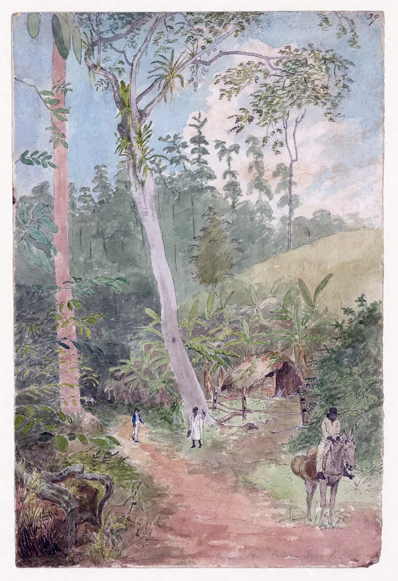
Photo: William Berryman, Public domain, via Wikimedia Commons
Open a U.S. gallery listing for Harada Masayuki and there is a good chance you will see the same word: minimalism. It shows up in collector spreadsheets, auction notes, Instagram captions, and the kind of wall text that tries to explain a whole career in three lines. It is an easy word. It is also doing less work than it looks like.
I am not here to ban a word. Minimalism is a real movement with a real history, and some of it is magnificent. But when 'minimalism' becomes the default label for Harada's drawings, it flattens the thing that makes them strange and specific. His work is not built on removing the hand. It is built on arranging intervals—between lines, between objects, between the edge of the paper and the edge of the room. That is a different argument.
How the Label Caught On
The shorthand arrived for practical reasons. American galleries need categories. Online marketplaces need filters. A drawing with a lot of white space and a few black lines is easy to file next to artists who also use a lot of white space and a few black lines. In the 2020s, 'Japanese minimalism' became a useful phrase for U.S. buyers who wanted a calm, design-friendly story. By 2026, it is almost automatic.
But categories are not descriptions. They are shortcuts, and shortcuts have a way of becoming expectations. Once a Harada drawing is called minimalist, viewers start looking for emptiness. They miss the evidence: the slightly unsteady line, the place where the ink was corrected, the edge that was left rough on purpose.
What American Minimalism Was Actually Doing
American Minimalism of the 1960s—Donald Judd, Frank Stella, Dan Flavin, Robert Morris—was not just 'less stuff.' It was a set of arguments about objects, industrial fabrication, and the viewer's body in space. The work often wanted to remove the artist's hand, or at least make it look unnecessary. A Judd box does not want to feel homemade. A Stella painting does not ask you to lean in and find a wobble.
Harada's work asks for exactly that kind of leaning in. His lines have weather. His paper has weight. His edges are not factory-perfect; they are decided. He is not reducing an image to an object. He is composing a sequence of pauses and pressures. You can call that minimal if you want, but you are using the word as a vibe, not a description.
A Better Working Term: Intervalism
Here is a working term I have started using: intervalism. It is not a movement, and it is not meant to be a gate. It is a tool. Intervalism describes art organized around what happens between things—between two lines, between a mark and a margin, between the viewer and the page. The line is not the subject. The gap is.
The term fits Harada because his drawings are full of decisions about distance. How far apart should two marks sit? How much paper should be left above a shape? When does a pause become a sentence? Minimalism tends to ask, 'What can be removed?' Intervalism asks, 'What is the right distance?' Those are different questions, and they lead to different looking.
Three Works, One Test
Test the term against three specific works.
First, 'Morning Train, Yamanote Line' (2016). At a glance, it is two horizontal lines and a wide field of paper. A minimalist reading says: reduced form, empty space, done. An intervalist reading notices the gap between the lines is not empty. It is the length of a commute, the pause between stops, the moment when a car full of people goes quiet. The drawing is not about the lines. It is about the interval they create.
Second, 'Two Cups, One Unwashed' (2009). Two cup outlines sit near each other, but not evenly. The space between them is slightly too wide, and the right cup is drawn with a heavier line. Minimalism would smooth that out. Intervalism explains why the unevenness matters: the gap is the residue of a real morning, not a design decision. The drawing is holding a small domestic distance.
Third, 'Blue Stair, No Building' (2021). A blue field meets the edge of a stair. There is no building, no railing, no context. A minimalist label would praise the reduction. An intervalist label would point to the edge—the place where blue stops and paper begins. That edge is not a border. It is the subject. The drawing is about the moment before a step, not the step itself.
What Changes If We Use It
If we stop calling Harada's work minimalist, we do not lose a useful word. We gain better questions. A gallery wall text could say 'interval' instead of 'emptiness.' A collector could ask, 'Where is the pause in this piece?' instead of 'Why is there so much white space?' A U.S. buyer comparing two drawings could compare distances, not just amounts of ink.
None of this is about correcting anyone. It is about seeing more. Harada's work is quiet, but it is not empty. It is full of intervals. The least we can do is use a word that notices them.